How to Match Clothing Colors Without Overthinking It

Matching colors isn't an exact science. Most of the confusion comes from rules that sound way more complicated than they need to be.
The color wheel, simplified
Colors sitting next to each other on the wheel pair up effortlessly. Colors across from each other create bold contrast. That's really the whole theory you need to carry around in your head.
Monochrome: the safest bet you can make
Shades of the same color, from light to dark, are nearly impossible to get wrong. Play with the intensity so the outfit has depth instead of looking flat.
Neutrals: your backup for any wardrobe emergency
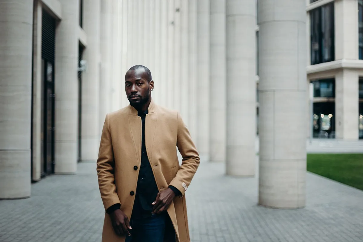
Black, white, beige, gray, and denim solve almost any combination because they don't compete with anything else in the outfit.
How to use an accent color
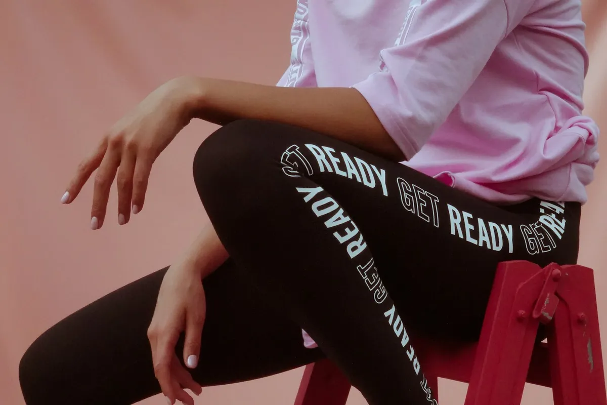
Pick one standout color and let it show up in a single piece, maybe two if they're small accessories. Any more than that and it stops reading as intentional.
Analogous vs. complementary
Analogous colors build soft, easy, everyday looks. Complementary colors create the kind of contrast that actually grabs attention.
Colors that work on every skin tone
Navy, true red, emerald green, and ice white flatter most people, regardless of undertone. They're a reliable starting point when you're not sure what else to reach for.
Common mistakes
Mixing warm and cool versions of the same color, wearing three or more accent colors at once, and treating a bold print as if it were neutral are the usual culprits.
How to test a combination before you leave the house
Take a photo of the outfit, look at it from a distance, or ask someone with zero context for their honest first reaction.
You don't need a course to match colors well. Neutrals do the heavy lifting, one accent color adds the punch, and everything else is just training your eye over time.
Where Color Rules Actually Came From
The idea that colors can be formally "matched" or "clashed" isn't just a personal styling opinion — it's backed by an entire industry built around standardizing color. Pantone, the company behind the familiar color-matching swatches, launched its Color of the Year program in 1999 specifically to track how color moves through culture and design, as Pantone explains on its own site. Each year, a global team at the Pantone Color Institute studies everything from film and art to travel and socio-economic shifts to choose a single shade meant to capture that year's mood, which is why the "right" colors for an outfit genuinely do shift year to year rather than being fixed forever.
That history matters for everyday dressing because it explains why some color pairings feel dated and others feel current: it's rarely about the colors being objectively wrong together, it's about which combinations the culture is currently primed to read as fresh. Leaning on the color wheel basics in this piece gives you a pairing that will never look wrong, while paying occasional attention to what's trending is what keeps an outfit from feeling stuck in a previous decade.
How Designers Bend the Rules on Purpose
Once you understand the basic wheel, it's worth watching how working designers break from it deliberately. Coverage of the autumn/winter 2025 runways from Vogue Arabia points to Gucci pairing deep green, mustard, and violet, and Tory Burch going further with lime green trousers against a brown jacket accented in orange and parrot blue — combinations that look nothing like a textbook complementary pair but still read as intentional because each look sticks to two or three colors rather than scattering five. The same season's color conversation, as reported by Vogue, was also dominated by Mocha Mousse, a deep chocolate brown treated as a neutral backdrop that other colors, like icy blue or soft pink, get layered against. That's the same accent-color principle from earlier in this piece playing out on the runway: one dominant tone doing the heavy lifting, with a single contrasting color allowed to stand out against it.
You may also like
Fashion
Kitten Heels Are Fall 2026's Breakout Shoe Trend: Budget-Friendly Ways to Get the Polished Look
Fashion
The Leggings Revival Is Back for Fall/Winter 2026: Budget Ways to Style the Runway Comeback
Fashion
The Glossy Trench Coat Trend Is Everywhere This Fall — Here's How to Get the Look Without the Designer Price Tag